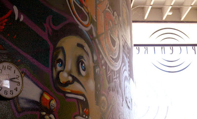
My initial photo internship assignment is to take "business" photos; that is, photos of the interiors and exteriors of select businesses to accompany directory listings. This takes me to bars, clubs and restaurants all over town. I like this photo of the Epicenter (a music venue) interior but I decided that it was too artsy for the directory, which calls for more practical photos of say, sitting areas, stages, tables, etc.
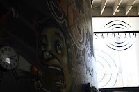
This photo experienced extensive photoshopping. The original photo:
 Slightly intriguing, but too dark and bleah, right?
First things first: straighten the horizon by selecting the entire image and rotating. There is a place for unstraight horizons, but unless it's intentional for certain effects, it can be visually annoying. Next, crop out the distracting stuff that doesn't lend anything to the image, like in the bottom right corner.
Then, when the overall composition is good, work on the image quality. Change levels: since the left 2/3s is almost monotonously grey, I brought up the whites to lighten things up. Increase saturation of colors, then change the color balance, especially for the reds and magentas - those are the brightest colors on the actual mural. Finally, up the contrast.

2 comments:
The other option, I suppose, would have been to fix those errors when you took the original photo. Eg. better framing, using a graduated neutral filter to achieve correct exposure. It would've been much quicker than photoshopping!!!
:o)
Thanks for the tip.
FYI, photoshopping takes about 2 minutes, and a "Canon graduated neutral filter" costs at least $60 US on Amazon.com.
Post a Comment