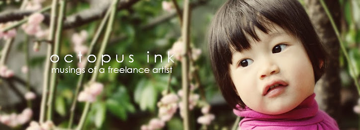
 For the longest time, my website splash page photo featured the family of three amongst tall grasses, the parents looking fondly at their daughter, the little girl clutching a flower and looking at the camera. As I was editing GinkgoPhotothon pics today, I came to this photo. And I had a Wow, Did I Take That? Moment. This is now my splash page photo.
It isn't perfect. The major fault is that a blossom branch runs almost straight down the middle of the photo. I could crop the pic I suppose, so that the branch is no longer centered, but I didn't want to cut out any more the raining blossom branches. I think the environment the blossoms create outweighs the compositional discomfort of that central branch. Also, the asymmetry of the girl and the tree trunk help balance that out. Here presence is much greater than the branch, and you notice her first.
 More TinyPrints news. I'm enjoying being an insider in the industry, even if I only have a pinky toenail on the inside. It seems they are expanding their service to cover teen events, as well as babies and kids, and are thus specifically looking for photos of teens to use in their sample cards. Apparently, teen boy photos are the most challenging to get a hold of. So, they gave me a list of photos they'd like to use, and most of the requests are of teens, and a few are of my signature baby and family photos. Next step is for me to contact the parents, and ask if they'll let TP use the pics.
In other news, I received my new postcards. They printed out a bit dark, with a slight blue-ish hue. The warmer colored photos look OK, but those taken in a whiter light - ARGH, the subjects look a little blue and, well, zombie-ish. Just slightly. A not altogether healthy pallor. I gave one to the UPS guy who delivered the box of 250 postcards to me, and he thought it looked great, so maybe it's just my critical eye. Well, at least this way I won't feel stingy (and I mean as in Wanting To Keep Them All, not as in Bee Sting - you'd think these would be spelled differently) about leaving piles of cards here and there, to use em up.
And finally - remember those corporate head shots I was fretting about? I need not fret, because they actually want "natural" looking head shots, in front of shrubbery, in natural light. That's why they chose me. Well, that all makes a lot of sense.

No comments:
Post a Comment